Vinamilk new identity
Not a dairy brand, part of life.
Logo
While “milk” is in our name, it stands for so much more than dairy. It marks the quality and care of our products and for people since its establishment in 1976, which we've now embedded in the mark. The custom letterforms are a modern take on the rich history of Vietnamese calligraphy.


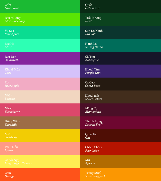
A palette with unique flavor.
We’re still a blue brand, but now we have an additional palette, as vibrant and diverse as local produce and ingredients you can find here. These colors allow us to show up in new and vibrant ways supporting our expansion into all types of food.
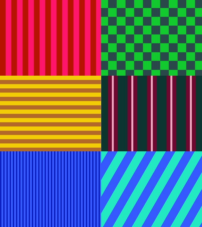
A never ending library of energy & abundance.
Our brand reflects the spirit of Vietnam, which is vibrant and dynamic. We use endless combinations of color that allow us to create patterns for anything from packaging to fashion.


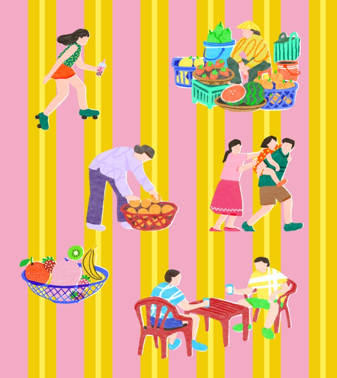
Inspired by the lives of the Vietnamese.
Our hand drawn illustrations are inspired by the rich artistic heritage of the nation found in vintage posters, stamps, and artwork. They show the liveliness and dynamism of Vietnamese life and show our role in every generation’s life. These illustrations allow us to tell stories about life in Vietnam here and around the world.
A custom voice as bold and warm as we are.
Vinamilk now has an entirely custom typographic system tailor-made to support the brand identity with four custom typefaces that elegantly dance between sans and serifs, fusing hand-done calligraphic inspiration and precise digital construction. This suite is carefully crafted optimizing forms and spacings for multi-lingual use with bespoke modernized calligraphic diacritics. Together, this contemporary family of typefaces serves the brand’s wide range of needs and reflects its multifaceted personality from brave challenger to wholesome nurturer.

Admin
Link nội dung: https://ngayqua.com/vinamilk-new-identity-1732012528-a13007.html