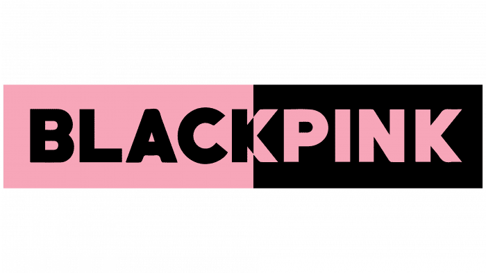
Blackpink Logo
The Blackpink logo reflects the name and style of the South Korean pop group. He also hints that the team includes girls who like everything delicate and glamorous.
Blackpink Logo PNG
The Blackpink logo reflects the name and style of the South Korean pop group. It also hints at the team members’ affinity for all things delicate and glamorous. Yet, simultaneously, it suggests a penchant for the toughness sometimes seen in their videos and songs.
Blackpink: Brand overview
| Founded: | 2016 – present |
| Founder: | YG Entertainment |
| Headquarters: | Seoul, South Korea |
| Website: | blackpinkofficial.com |
Blackpink is a South Korean girl group founded by YG Entertainment. It emerged in 2016 and quickly gained popularity in many countries worldwide. The group consists of four members and debuted with the album Square One. They work in several contemporary genres: K-pop, EDM, hip-hop, and J-pop.
Meaning and History

The Blackpink logo represents the contrast between light and dark, positive and negative, fair and unfair. It is an attempt to unite the opposites that constitute the eternal concepts of humanity. The emblem reflects the performers’ emotions as they feel the vibration of the modern world.
The group’s trademark visually corresponds with its style and repertoire: elegant, youthful, and unusual. At least, according to its creators, nothing like it has ever existed. It accurately characterizes the modern genres, conveying their inner spirit.
What is Blackpink?
Blackpink is one of the most famous and successful music groups from South Korea. The female group released its first joint single in 2016. Their talent has been recognized with high positions on the Billboard Hot 100, Billboard Artist 100, and Billboard Emerging Artists charts. Their music videos have also broken numerous records for views on YouTube.
The logo consists of a wordmark (name) set against a monochromatic background. The color palette is a combination of white and pastel pink. The base is a rectangular plate. Additionally, there is no clear correlation between the element and color in the logo: in some versions, the letters are pink with a white background, and in others, it’s the opposite.
Blackpink: Interesting Facts
Blackpink is a music group from South Korea that has fans all over the world. They’re known for their cool songs, stylish clothes, and making history in music.
- Starting Out: Blackpink was put together by YG Entertainment and started with their first songs on August 8, 2016. The group has four members: Jisoo, Jennie, Rosé, and Lisa.
- Big Hits: Their song “Ddu-Du Ddu-Du” became very popular on YouTube, breaking records for the number of people who watched it.
- Famous Worldwide: They’ve gotten much attention worldwide, even making it onto big music charts in the U.S. They were the first K-pop girl group to perform at Coachella, a huge music festival.
- Fashion Leaders: Each member of Blackpink works with big fashion brands like Chanel and Dior. They’re not just music stars; they’re fashion icons, too.
- Working with Other Stars: They’ve made music with famous singers from other countries, like Dua Lipa and Lady Gaga, which has helped them become even more well-known.
- Speaking Many Languages: The members can speak several languages, including Korean, English, Thai, and Japanese. This helps them connect with fans everywhere.
- Huge on Social Media: They have tons of followers online, making them one of the most popular groups on social media.
- Top-Selling Album: Their album “The Album” came out in 2020 and sold more copies than any other album by a K-pop girl group before.
- Guinness World Records: They’ve set records for the most YouTube views in 24 hours and have the most music group subscribers.
Blackpink has gone from being a new name in music to being a superstar worldwide. They’re known for their music, their style, and the big impact they’ve had on both.
Font and Colors

The girl group chose the name Blackpink because pink is a classic expression of femininity, while black is an archetype of strength and bravery. The creators of the musical quartet wanted to emphasize that its members are beautiful girls and determined individuals.
The brand name is minimalist and modern. There’s nothing superfluous—only confident and clean lines that match the character of the four vocal musicians. To create the ideal visual representation, designers chose the traditional Helvetica font.
The word is written in capital letters. Two of them are mirrored (“C” and “N”), and one lacks a horizontal bar (“A”). This graphic technique makes the emblem well-recognized, relevant, and youthful.
Blackpink color codes
| Amaranth Pink | Hex color: | #f4a7bb |
|---|---|---|
| RGB: | 244 167 187 | |
| CMYK: | 0 32 23 4 | |
| Pantone: | PMS 1765 C |
| Black | Hex color: | #000000 |
|---|---|---|
| RGB: | 0 0 0 | |
| CMYK: | 0 0 0 100 | |
| Pantone: | PMS Process Black C |
Admin
Link nội dung: https://ngayqua.com/blackpink-logo-1731648605-a11789.html